Gran Sogno Wine Branding

Overview:
The Gran Sogno wine label and branding project aimed to create a captivating and romantic visual identity for the brand, encapsulating the essence of the wine's smoothness and allure. Designer Gibran embarked on a creative journey to develop a design that would evoke emotions of elegance, luxury, and passion while ensuring a seamless connection with the product's inherent qualities.
Design Concept: Romantic Elegance
Gibran's design concept was centered around the idea of "Romantic Elegance." The goal was to create a visual representation that intertwined the smooth nature of the wine with a sense of romantic allure. This concept guided every aspect of the design process, from color selection to typography and imagery.
Color Palette:
The color palette chosen by Gibran reflected the wine's character and the emotions it sought to evoke. Deep, rich burgundy tones were used as the primary color, symbolizing the wine's robust flavor and sophistication. To infuse romance and softness, shades of blush pink were added, creating a delicate balance between passion and elegance.
Typography:
Gibran meticulously selected a typography combination that harmonized with the overall design concept. A combination of a classic serif font and a flowing script font was chosen. The serif font exuded a timeless elegance, while the script font added a touch of handwritten intimacy, reinforcing the idea of a personal connection with the wine.
Label Artwork: Smooth Flourishes
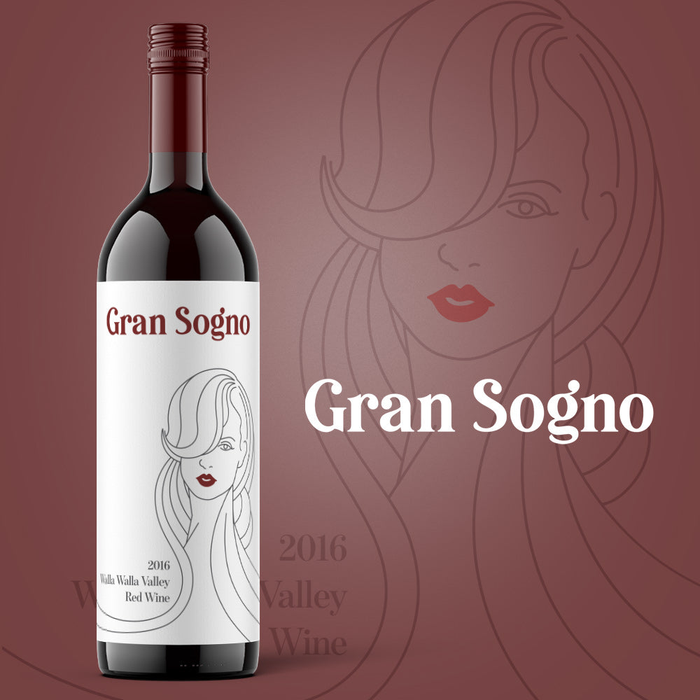
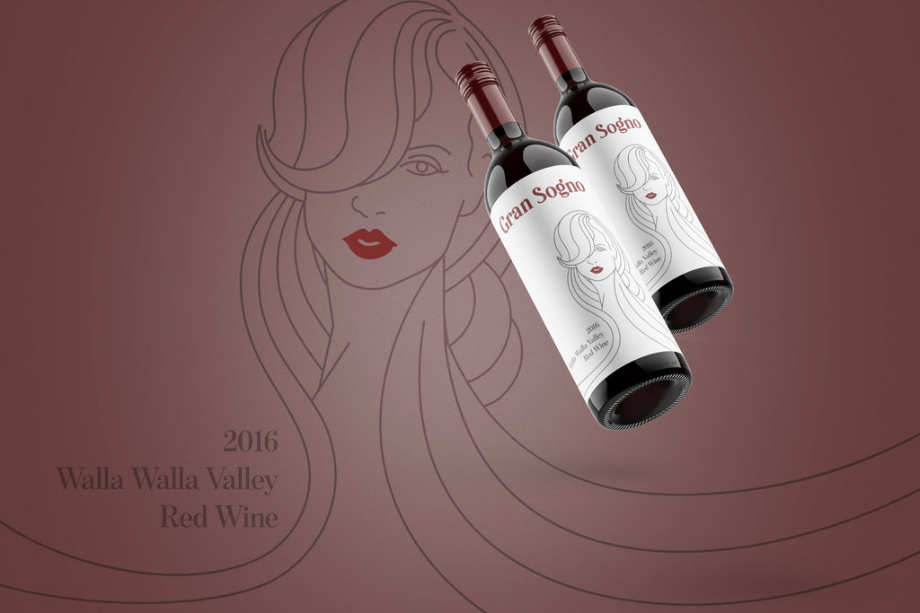
The label artwork was where the romantic and smooth aspects truly converged. Gibran crafted intricate flourishes that subtly embraced the curves of the bottle, resembling tendrils of vines while maintaining a sense of effortless fluidity. These flourishes created an almost dance-like movement across the label, symbolizing the wine's smoothness. Embedded within the flourishes were subtle motifs like grape leaves and swirling patterns, adding depth and visual interest to the design.
Branding Elements: Creating the Atmosphere
Beyond the label, Gibran extended the design concept to various branding elements. The brand's logo was an interplay of the serif and script fonts, forming an elegant yet approachable identity. For collateral materials such as wine boxes, promotional materials, and even the website, the same design elements were utilized, maintaining a consistent and immersive brand experience.
Texture and Finishes: Touch of Luxury
To further elevate the brand's perception, Gibran incorporated tactile elements into the design. The use of high-quality paper with a soft, matte finish lent a tactile experience that aligned with the wine's smoothness. Additionally, subtle embossing and foiling were applied to the label, adding a touch of luxury and depth to the design.
Conclusion: Romantic Smoothness Captured
In the Gran Sogno wine label and branding project, Gibran successfully captured the essence of romantic smoothness. The interplay of colors, typography, intricate flourishes, and tactile finishes came together to create a cohesive and enchanting visual identity. The final design resonates with wine enthusiasts seeking not just a drink, but an experience that encapsulates the joy and passion of savoring every sip. Gran Sogno's new branding serves as a testament to the artistry of design in evoking emotions and creating a lasting connection between consumers and the product.

