The Mark Ashley Co Rebrand
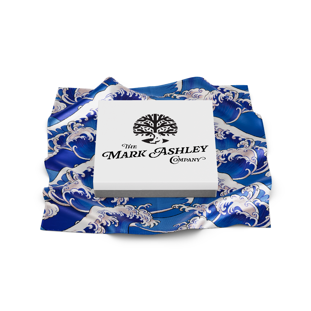
Mark and Ashley Michael commissioned me with the task of revitalizing their company logo. The initial design, a result of Mark's amalgamation of various web elements, had run its course and was ready for a transformation. Holding onto the essence of the original concept—depicting Mark as a polar bear leaning on Ashley, the Tree, with both characters warmly embracing a buzzing bee, symbolizing the synergy of their friendship and ideas—I embarked on a journey of enhancement.
Through a careful interplay of imagery and the artful utilization of negative space, I have crafted a new logo that boasts versatility across different scales while eloquently narrating their distinctive story.
Projects
In a thrilling departure from the traditional Formula 1 liveries, the concept of a custom Roy Lichtenstein livery for the "Roy Lichtenstein Racing" team envisions a high-speed canvas of artistry a...
Read moreEmbarking on our world-spanning expedition has ignited a transformative phase in my creative journey. As I navigate the post-travel period, I find myself sculpting the contours of my creative outp...
Read moreMark and Ashley Michael commissioned me with the task of revitalizing their company logo. The initial design, a result of Mark's amalgamation of various web elements, had run its course and was rea...
Read moreDuring my rookie year in the NFL I spent many of my free hours designing football uniforms on the NCAA Football Playstation game with my teammate Matt Bowen. Now after a 6-year NFL career as a Qua...
Read more